PowerPoint 2010 Advanced: learn how to make charts

Are you about to prepare a serious PowerPoint presentation? Then don’t miss this extract from “PowerPoint 2010 Advanced”. There are multiple features on PowerPoint, and there’s always something new to learn. Have a closer look at how to make charts.
Charts in PowerPoint 2010 are very different from earlier versions and for the most part it is just like working in Excel. In fact the underlying datasheet IS Excel and when you select the data or edit the data you will be working in the underlying spreadsheet. The charting program is exactly the same otherwise as you would find in Excel.
An embedded chart appears on the slide where it was created. It is an embedded object, which does not normally appear in its own window, and has no separate existence apart from the slide.
Chart Elements
Chart Element | Description |
| Titles | This is the area where you can specify the titles to have on the chart (i.e. X-axis “1998”, Z-axis “GBP” |
| Axes | Here you specify whether you want a Y/Z axis and whether you are using timescales to plot your data |
| Gridlines | The gridline ribbon allows you to switch on and off horizontal and vertical gridlines |
| Legend | Use this ribbon to switch the legend on and off or reposition it |
| Data Labels | The Data Labels ribbon allows you to display the amount each point represents or display the label (i.e. in the example above, each cylinder would have Qtr1, Qtr2 displayed as appropriate at the top of each data marker) |
| Data Table | The Data Table ribbon will display a grid underneath the chart that will show the information that is being plotted. |
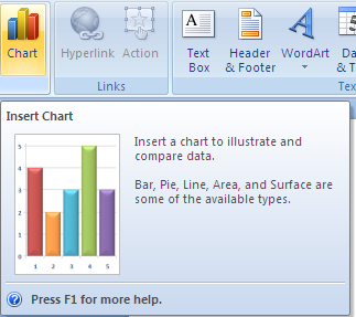
To create a chart
Mouse
or
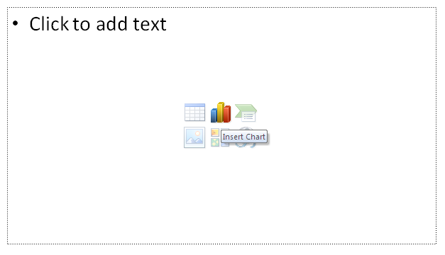
i. Click on the chart icon of a slide with a chart contet
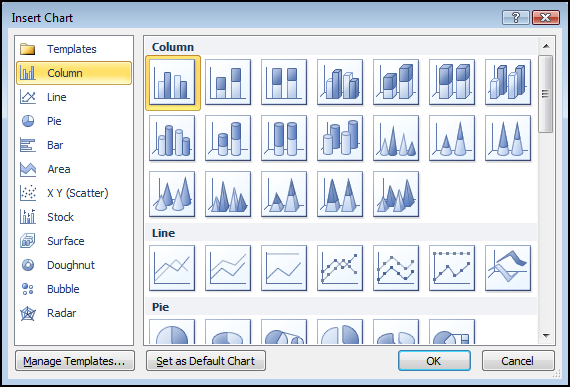
ii. The same insert chart dialog will appear
iii. Make a selection and click OK.


