Creating and editing a column chart

A nice column chart can illustrate your results and convince your audience. Learn how to create and edit column charts with these easy steps. To get started now, please read on.
Column charts are great when used with data that has up to 12 data points. If your data has fewer than 12 data points or ranges then choose a column chart.
Insert a column Chart
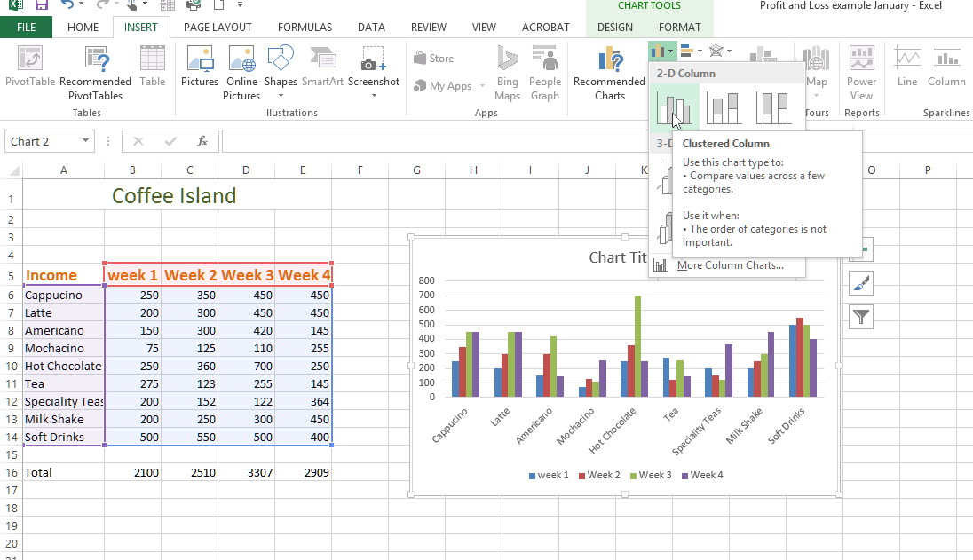
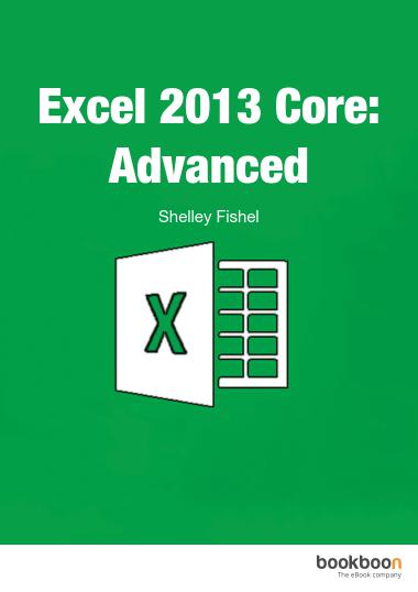
Figure 33- Sales of each type of drink sold at Coffee Island
- Select the data you want to chart
- Click on the Insert Ribbon Tab
- Select the type of column chart you want to use – note that Excel does help by giving you pointer on when to use each type of chart
- The chart is placed on your spreadsheet immediately
Edit the chart
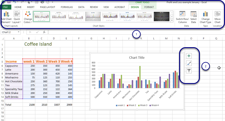
Figure 34- many ways to format a chart
In Excel 2013 there are more ways to get to the various customization options.
When you add a chart Excel pops up two new Ribbons, Design and Format. Use these Ribbons to change the way your chart looks and is formatted. (1)
New in Excel 2013 is the ability to add and change chart elements from the pop out icons next to the chart itself. (2)
Creating pie charts
A pie chart is great for showing the way that 100% is divided between the items you are charting. I can either see how the coffee sales divide up among the months, or how each month divides up amongst the coffee types. As a pie chart looks at just 100% it is not used to compare, in the same way a column or bar chart are used.
Pie chart

Figure 35- a pie chart divides 100% into segments
- Select the data
- Click on the Insert Ribbon
- Click on the drop down below the Pie Chart Icon
- Choose which type of pie chart you want to use
- The pie chart Appears!
I am looking at how the different types of coffee divide up in January so I selected just the January figures with the types of coffee labels.
Modifying charts using the Ribbon
The way that charts are modified follows the same general process for all chart types. There are two ways to modify charts:
- The Ribbon
- The Chart Tools on the worksheet next to the chart.
Using the ribbon
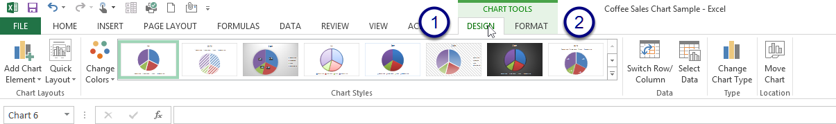
Figure 36- Contextual ribbons for charts
When you have added a chart to your worksheet, you will notice the appearance of two new Ribbon Tabs under the general heading Chart Tools.
The Design Tab and the Format Tab
The Design Ribbon
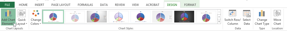
Figure 37- The Design Ribbon
The Design Ribbon offers you lots of ways to customize the chart and make it your own style.
Add chart elements
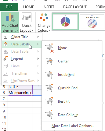
Figure 38- add Chart Elements to make the chart easier to read
Chart Elements allow you to add elements to your chart to make it easier to read or style
Chart Title – decide if you want a title and where it goes
Data Labels – again you decide how they are placed and where
Data Table – this depends on the type of chart you are working with – it allows you to add the data underneath the chart – try it out and see
Legend – allows you to add a legend and decide on its placement
Lines – this will be available if you have a chart that supports it
Trend line – again if you have data and the right type of chart this will be live
Up Down Bars – in a Line Chart you can add Up Down Bars to show movement
Grid lines – this option is available when you have a chart that supports displaying grid lines
Quick layout
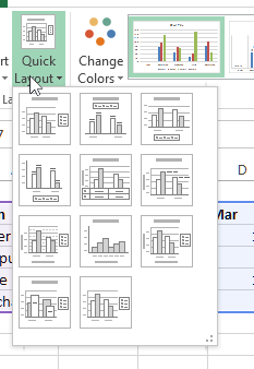
Figure 39- change the way the chart looks quickly
Use the Quick Layout to change the way the data is set out – you can choose from a selection of presets.
Change colours
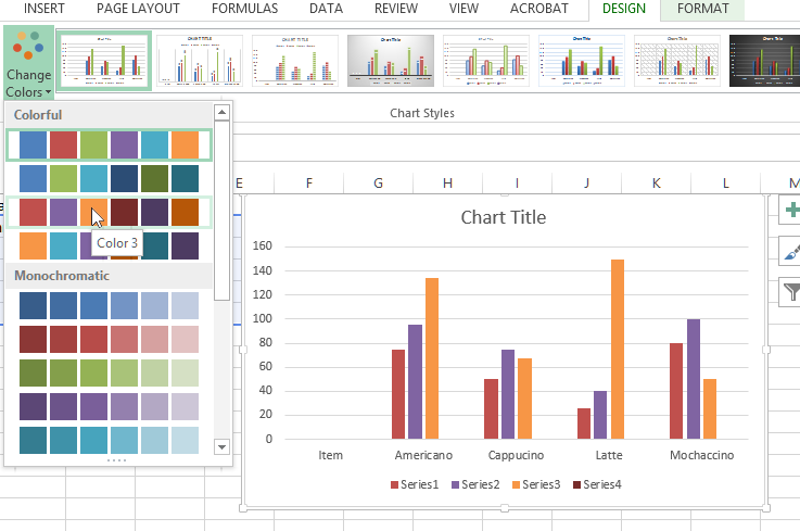
Figure 40- modify colours to match your style
Change the colours of the bars or lines in your chart with the Change Colours icon. Select from colourful or monochrome themes.
Chart Styles
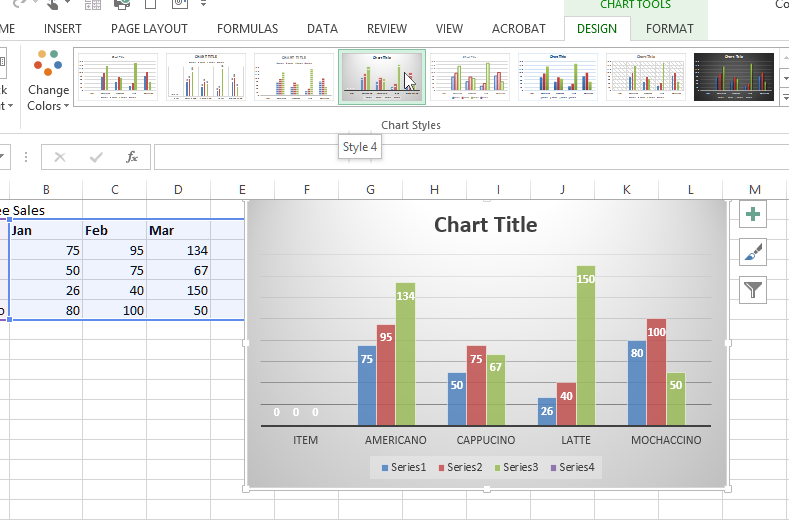
Figure 41- make a chart your own by changing the style
Select from one of the preset chart styles in the gallery to change how your chart displays. You will see a live preview of how it looks as you hover over the different styles and by clicking on the style it is applied.
Switch Row/Column
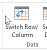
Figure 42- change how the chart uses your data
In the chart I have the months as the series and the types of coffee in clusters – if I want to see the data the other way around I can Switch Row/Columns.
We hope you found this article helpful and learned something new. If you would like to improve your knowledge on Excel 2013, check out the Excel 2013 Core: Advanced. Don’t forget to share it with your friends or colleagues if you think they could benefit from this article. You might also want to check out other Excel blogs such as “How to assign shortcuts in Excel 2013”, “How to use the IF Function in Excel” or “How to make Excel files compatible with older MS Office versions” and “How to add value to workbooks in Excel“.